Please note: Support for this plugin is no longer available.
The social media share plugin we developed, Trackable Social Share Icons, is growing increasingly popular, and we are receiving more and more questions about how to customize it. The placement and appearance of the social media icons is highly customizable — you can even use your own custom icons if you want. But the majority of the customization of the placement of the icons is done through the CSS block that you can edit in the Trackable Share admin area.
Today I though it’d be nice to give a couple of examples of how to modify this CSS block to give different positioning and appearance aspects to the icons.
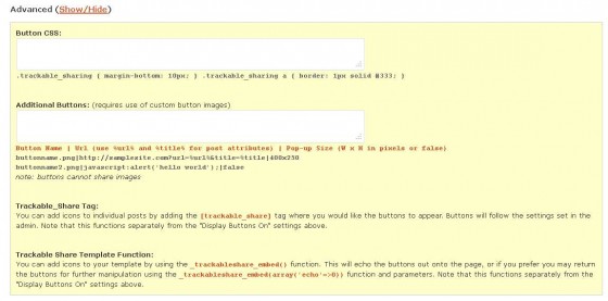
But first, to edit these you’ll need to go to your WordPress admin, and in the left navigation menu under “Plugins” will be “Trackable Share.” Click on that to get to the Trackable Social Share Icons admin page. Toward the bottom is an “Advanced Show/Hide” section. If you click on that you’ll see the CSS block where you can customize the icon style sheet. Note that you can click on the lower right corner of the block to expand the working area.
Here’s what this section of the admin looks like:
 We’ll be tweaking the top “Button CSS:” section to change the appearance of the Trackable Social Share Icons.
Right-Aligning the Social Media Icons
By default the social media icons appear left-aligned either at the top, or bottom, or both top and bottom of your posts, depending on what you have selected. However, with the CSS block we can change that positioning and even toss a nice little top border in. Here’s the code:
.trackable_sharing {
border-top: 1px solid #EEEEFF;
padding-top: 1em;
text-align: right;
}
With this CSS our icons will now look like this (with bottom position selected):
Enclosing the Icons in a Box
Here’s another customization option that puts a box around the icons, and makes the icons center aligned. Here we’re specifically putting the custom text outside of the box:
.trackable_sharing {
background: gray;
border: 1px solid #CCCCFF;
border-radius: 4px 4px 4px 4px;
margin-top: 2em;
-moz-border-radius: 4px;
-webkit-border-radius: 4px;
-o-border-radius: 4px;
padding: 3px;
text-align: center;
}
.trackable_sharing_text {
position: absolute;
margin-top: -2em;
font-style: italic;
color: #17345C;
}
.trackable_sharing > div {
float: left;
}
With this code, your social media icons will look like this:
Making the Icons Appear Vertically on the Left Side of Posts
We can even change the icons from appearing horizontally to appearing vertically and stacking them on the left side of the top of the post. For this we’ll need to set our icons to appear on the top of posts (rather than bottom) then add this text to the CSS block:
.trackable_sharing_text {
display: none;
}
.trackable_sharing {
border: 1px solid #CCCCFF;
border-radius: 3px 3px 3px 3px;
float: left;
padding: 3px;
margin:1.3em 1em 1em 0px;
}
.trackable_sharing a {
display: block;
}
.trackable_sharing > div, .trackable_sharing > br {
display: none;
}
We also put a border around the icons, and now we have our icons appearing like this:
With the editable CSS block at our disposal, the customization options for the icons is almost unlimited. And if you want them to appear somewhere entirely difference, you can always place them exactly where you want in your template using the _trackableshare_embed() function.


