Within the internet marketing industry, one thing that you’ll hear often is the need for data, for hard numbers to drive fact-based decision making. This is absolutely true. Unfortunately for an industry that talks so much about the need for good numbers, there seem to be constant reports and “research” with really crappy methodology that renders their results statistically meaningless.
And yet, these reports then make the rounds of all the SEO and internet marketing blogs, complete with impressive looking graphs and heat maps.
In most industries when you see companies releasing research and white papers, you can pretty safely assume that they have good data. In the internet marketing industry you absolutely cannot — always, always check the methodology and look for glaring errors. If they don’t list their methodology, you can probably assume it’s largely fabricated. Here are the big mistakes that I see made consistently in research, reports, and white papers released by SEO companies that are, we can only assume, more interested in getting some links than in finding data with any actual meaning.
Statistically Significant Results: Sample Size
A statistically significant result is one that is unlikely to have occurred by chance. This means that a result that is not statistically significant isn’t actually telling you anything.
As an example, let’s say you want to know the chance of getting heads when flipping a coin. You flip the coin twice, and get tails both times. You then release a white paper revealing that it’s not possible for the coin to land on heads. You can now apply for a research position in many SEO companies.
The problem with this research is that you only flipped the coin twice. Your sample size was not statistically significant, and as a result you didn’t prove anything at all — your results could have been the effect of randomness (which in this case we know they were). But because the sample size was statistically insignificant, we don’t know anything — you’re results could be true, they could be false, but you didn’t prove anything one way or the other.
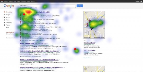
A statistically insignificant sample size is one of the most common problems in research that I see. As an example, Rosetta recently released an eye tracking study on Google instant and preview pane (note: eye tracking studies are a huge perpetrator of bad research for some reason). They published all sorts of great-looking heat maps … but then you go to the bottom of the report and look at the methodology and you learn that they did the eye tracking with a total of nine people. That’s it, 9 people.

With a sample size that small, you didn’t prove anything at all. By sheer randomness you could have ended up with people who behaved substantially different from the norm, or who had a predilection for looking at one area of search results or avoiding another. Their heat maps might even be right, but they sure didn’t prove it.
The statistics of sample size are a bit complicated, and those statistics are dependent on getting an actual random sampling of people, which introduced additional complications. But it’s pretty easy to apply a basic “sniff” test: clearly 9 people does not pass the sniff test. In general you want to see at least hundreds of random samplings, and the more the better.
Important Note: A vitally important note that a lot of people misunderstand regarding sample size is that if the sample size is too small, the results are actually meaningless. You cannot say “Yes, the sample was too small, but you have to admit the results were interesting.” — the results are not interesting, they are meaningless and do not prove or suggest or indicate anything.
Measuring What Your Measuring
Another area where internet marketing runs afoul of good research techniques is managing variables, and admittedly this is something very hard to do in the world of SEO, but that doesn’t mean you can avoid the issue and publish as if your results are science.
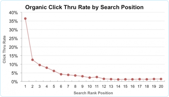
The classic example of this is research into click distribution in the Google search engine results page. This is the data that suggests what percentage of people click on the first result or the second result, etc. Most places I’ve seen that publish this information do bad science.
What they do:
Typically you’ll see a company with access to lots and lots of other sites’ Google Analytics — often a SEO agency or even a hosting company. They dig through all those analytics and identify thousands or tens of thousands of keywords. They strip out branded searches, and then identify how the sites are ranking for those keywords and then measure how much exact-match traffic the site is getting for those keywords. They compare this against the Google keyword tool traffic estimator to figure out what percentage of traffic the site is getting for the keyword. With tens of thousands of data points, they take the average or the median to determine the percentage of traffic that you can generally get based on position.
That sounds great, and they certainly have a lot of data points! But, what exactly are they measuring? They say their measuring the percentage of traffic the sites get based on rank — but they calculate that percentage based off of the Google keyword tool, something we know for a fact is inaccurate and imprecise (and Google tells us so themselves). So are they measuring click distribution, or are they measuring the variability of the keyword tool traffic estimations?
One way to check up on these kinds of report is to check the standard deviation (if they publish it — most don’t, either because they don’t know how to calculate it or they don’t want you to know what it is). 68% of all results will be within 1 standard deviation and 95% will be within 2 standard deviations. This means that the larger the standard deviation, the more all over the place the actual results were.
For example, let’s say our click distribution study showed that the number 1 position got 30% of the click throughs, but the standard deviation was 20%. That means that only 68% of the results were somewhere between 10% and 50% — a pretty darned huge margin of error. That means that the 30% number might not be that significant — sure it’s an average, but unless you have most of the results close to that number, the average doesn’t predict anything.
This was, by the way, the case with the 2011 Optify click distribution study — they depended on the Google keyword tool and their standard of deviation was huge.

So is it impossible to get good click distribution research? Not at all — it’s just a lot harder. The right way to do it is to actually use people and present them with various non-branded search results and have them click on one in an attempt to get to the most relevant site. You do this with thousands of people and tens of thousands of searches. This is good science (assuming good selection of keywords and participants) because you don’t have any extra variable that you don’t control throwing things off. Of course this is much harder to do, and thus doesn’t usually get done. It’s worth noting that the AOL study was in effect this kind of research, thus the results tend to be more meaningful. Unfortunately the AOL numbers were from AOL searches, not Google searches.
Research the Research
The important thing here is that while you generally shouldn’t take research at face value, you really shouldn’t take SEO research at face value. I’ve found that most of the time it’s actually bad science, usually spawned by laziness like the heat map studies using a total of 9 people, but sometimes also just poorly constructed studies that leave extra variables in.
Always read up on the methodology, which any good research will present, and look for egregious problems. You don’t have to be a statistician to apply the sniff test.


