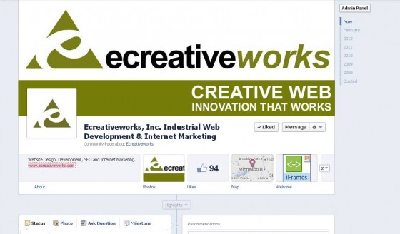
After months of speculation, Facebook Timeline for Pages was released the end of February. You may have already updated your cover photo and and looked around a bit, but what’s next?
Facebook is well known for their frequent format changes. I often feel like they never stop changing and for people like myself, who manage Facebook pages or use Facebook as part of a company or brand’s marketing strategy, it’s almost a part-time job keeping up!
Don’t fear! As Ecreativeworks’ resident Facebook geek, I’m here to give you the scoop. These are the main updates you’ll want to be familiar with.
Facebook Timeline Top Changes
1. Cover Image
The most obvious and visible aesthetic change is the cover image. The image size is 850 x 315 pixels, which can take up a lot of real estate and communicate a message well.
2. Cover Image Rules
The cover photo has restrictions. A lot of them. So, what are the restrictions? In a nutshell:
- No pricing or purchase info
- No contact information, whatsoever
- No references to Facebook platform features. Yes, really. No Like, no Share, No nothing!
- No calls to action, whatsoever. No “tell your friends, contact us today, no visit our website”
I’m excited to see how companies work within these rules… and I’ve got to hand it to Facebook for coming up with ways to keep Facebookland a little more challenging and creative for marketers.
3. Pinning and Highlighting
With the Facebook timeline changes you can not only “pin” an update or a post to linger on the top of your page for up to seven days, you can also “Highlight” a post by clicking on the star, enabling the post to appear in full size. For Facebook Pages where there is a lot of user generated content, this feature allows page admins to control what message is front and center.
4. Timeline and Timeline Milestones
The Timeline format updates how your visitors see your page content as it will all be visible and scrollable by date. This allows brands and companies a better format by which they can tell their story. It’s also possible to insert Milestones into your timeline, including backfilling past milestones. This could be useful if you want to record when you were founded or released a new product line. It will also be easy to hide posts no longer relevant without deleting them.
5. Messages for Pages
It’s now possible to not only send a message to a page, but reply as the page. I was very excited about this feature as there is often a conversation or a question on a wall that is best to continue in a less public space. When I am representing a brand or company, it is awkward to message some one on behalf of a brand from my personal profile.
6.Admin Analytics Panel
Notifications surrounding activity, New Likes, Insights and Messages are all front and center at the top of your page. This panel can also easily be hidden by clicking “Hide” and clicking “Admin Panel” to bring it back. There are also rumors about page admins being able to access real-time Analytics.
7. Larger Welcome Tabs
I have mixed feelings about this one. Although they have increased the space (810 pixels wide from 520 pixels wide), it’s no longer possible to set a default landing page for visitors. It will be fascinating to see what and how brands use this space. Tabs themselves are no longer located on the left navigation, they’re front and center, but expandable. Page admins can choose which tabs are highlighted.
So, how do you activate Timeline for your brand or company page?
Their preview manager is very impressive, walking you through the individual feature upgrades. And don’t worry, once you click, “upgrade,” you still have seven days to get your page ready to launch. But, if you don’t manually convert your Facebook page by March 30, 2012, Facebook will do it for you.
Have fun! In some instances, like this one, change is good. More space to brand, better control messages, tell a story and communicate with customers.


