If you haven’t headed over to your Google+ Business Page lately, it may be worth a look. Google+ has rolled out several new improvements that may be worth noting.
Cover Image
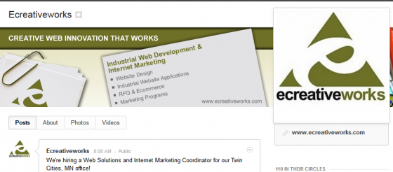
The most obvious and visual image you’ll notice is the cover image upgrade.
Cover image restraints are 940 x 180 pixels. It’s possible to either upload an image that is a minimum of 940 pixels wide, or, you can use their handy image tool to crop your image to the correct dimensions.
Google+ Business Pages also allow you the option to display five images instead of the one cover image in what they refer to as a “scrapbook” format, reminiscent of Facebook’s “Top Five.” I found it amusing that in the Google Official Announcement about these upgrades, that the most obvious upgrade, which obviously mimics Facebook’s recent Timeline format upgrade, was completely glazed over.
However! Good news for us marketing folk- unlike Facebook’s restrictions surrounding their new cover image, which you can read about in one of my previous blogs, you’re able to use your cover image to promote a product, your website, contact info, or include a call-to-action.
Profile Image
Profile images have moved to the top right and have become larger, allowing 250 x 250 pixels. Because the image appears larger than before, you may want to upload a higher-quality version if your previous profile image now looks grainy or pixelated.
Photo Albums and Videos
You’ll now notice that photo albums and videos are full-bleed (without borders) and appear much larger in the new upgrade. You’ll also notice that if you hover over an album, you’ll be able to see the whole album in a cool lightbox image over the photo.
Customizable Navigation
Your Google+ Business Page’s Circles are now viewable in the upper left navigation of your Page and you’re able to choose the two circles that are most applicable to your business move them to your top navigation. Expand to all of your circles by using the “More” dropdown.
Other Upgrades
Along with all of the image and video related upgrades, Google+ Pages for Businesses has also upgraded their discover section where users can spot tending topics on Google+ in addition to an improved Hangouts page appearing in the left navigation. Also worth noting is the ability for brands to view who is sharing and +1ing their posts or content. This is viewable by clicking on the + or Share icon on any post and an “activity drawer” appears that features a quick rundown of your post’s interaction history. It’s also, in my opinion, easier to toggle between your personal Google+ profile and your Google+ Brand Page(s). Simply click on your profile image and a drop-down menu appears of any Google+ Pages you manage.
Although Google+ has a long way to catch up with Facebook Pages, I’m looking forward to following the evolution of both platforms. Does your Business or Brand use Google+ yet? Have you added Ecreativeworks’ Google+ Page to your Circles?


